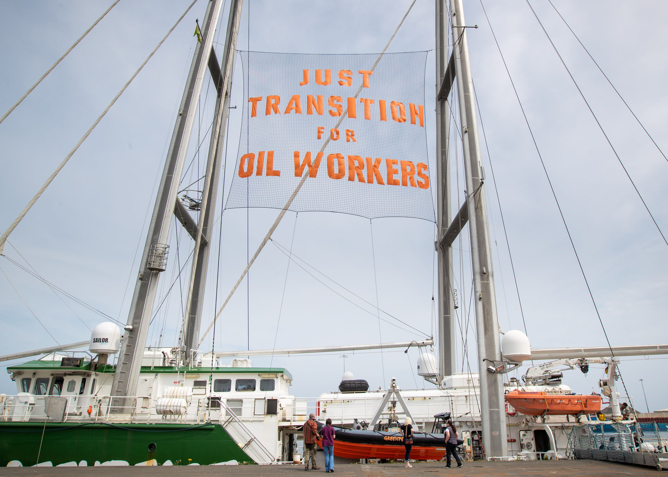
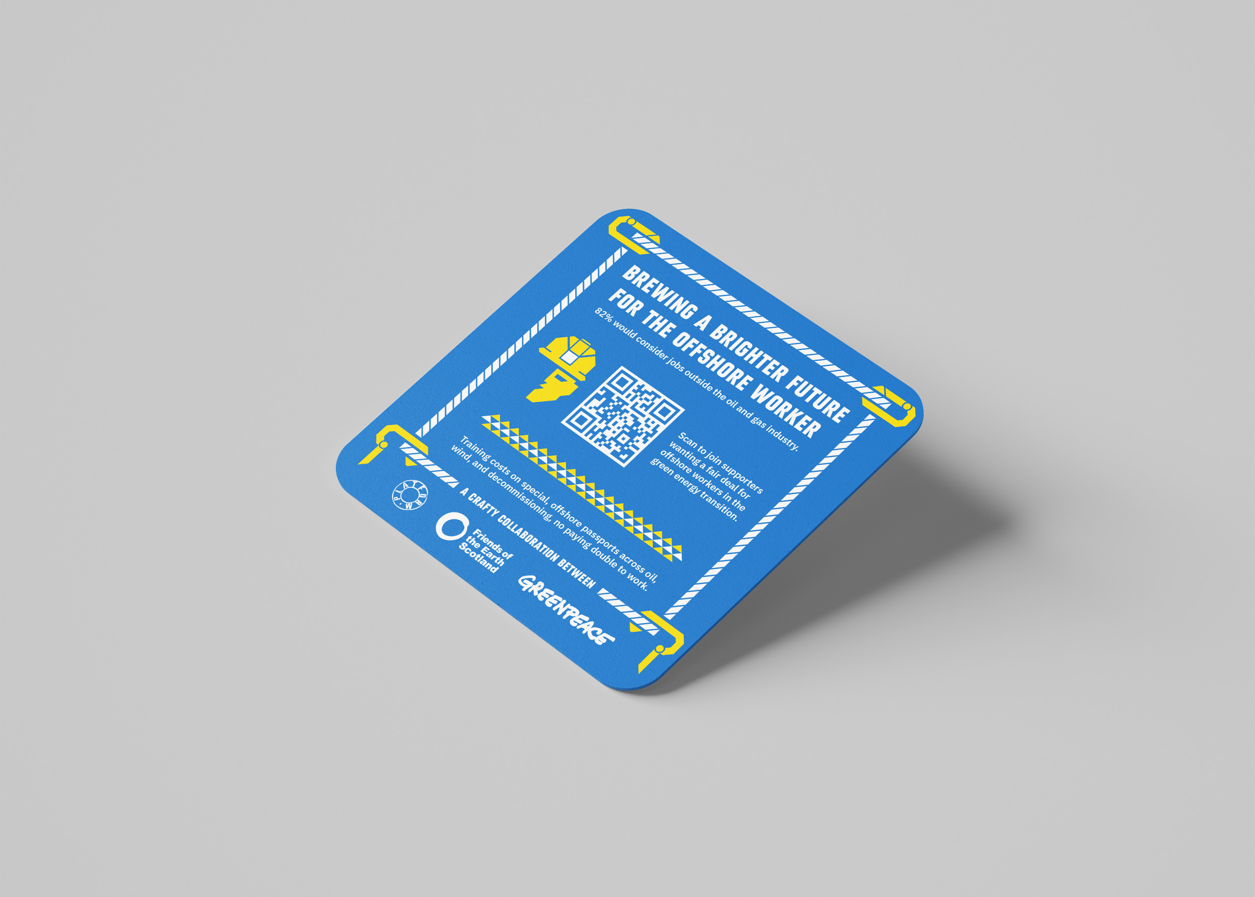
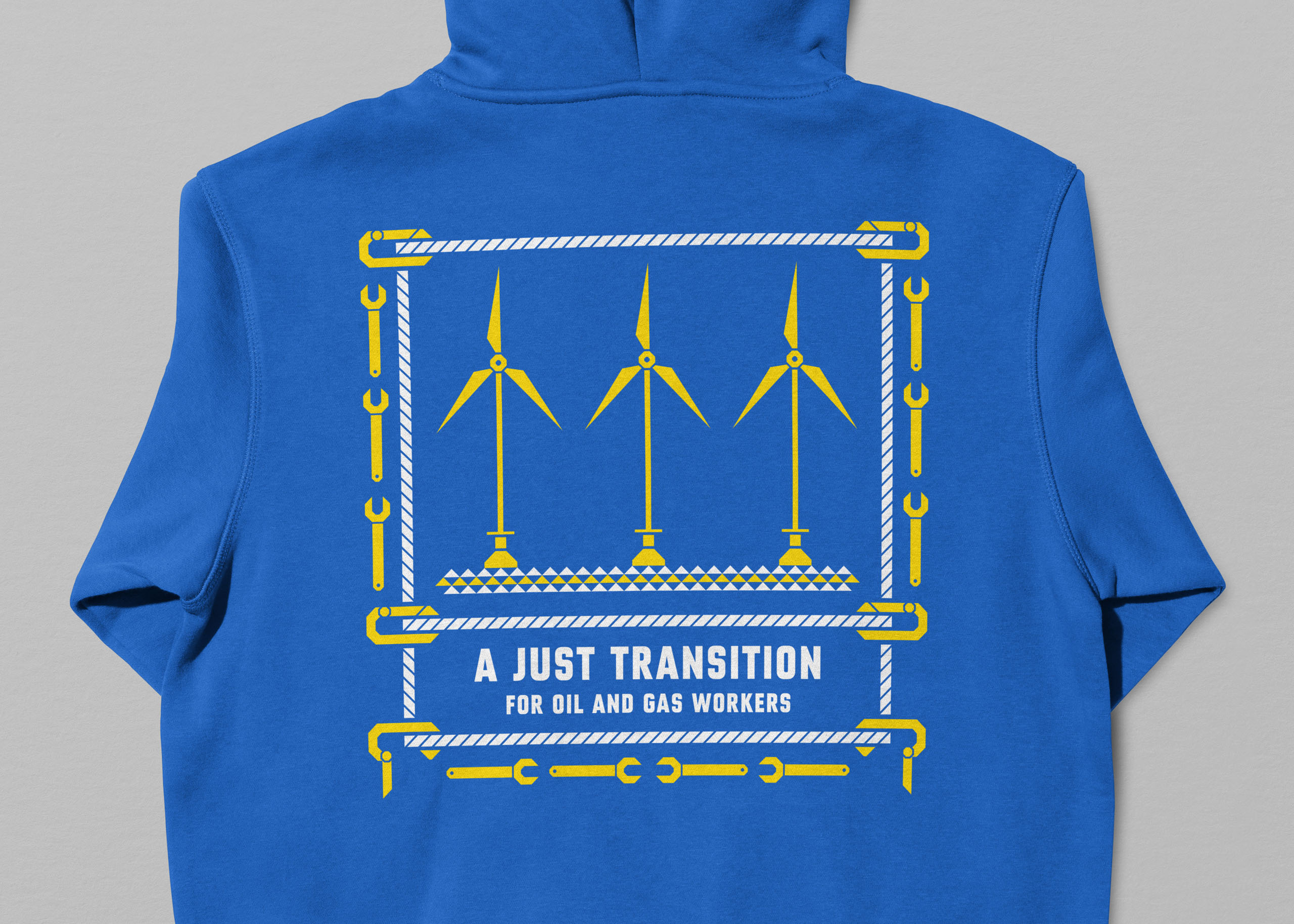
Greenpeace, Platform London, and Friends of the Earth Scotland asked us to create digital and print communications to promote Tour for a Just Transition: a campaign calling for fair retraining opportunities for oil workers wanting employment in renewable energy.
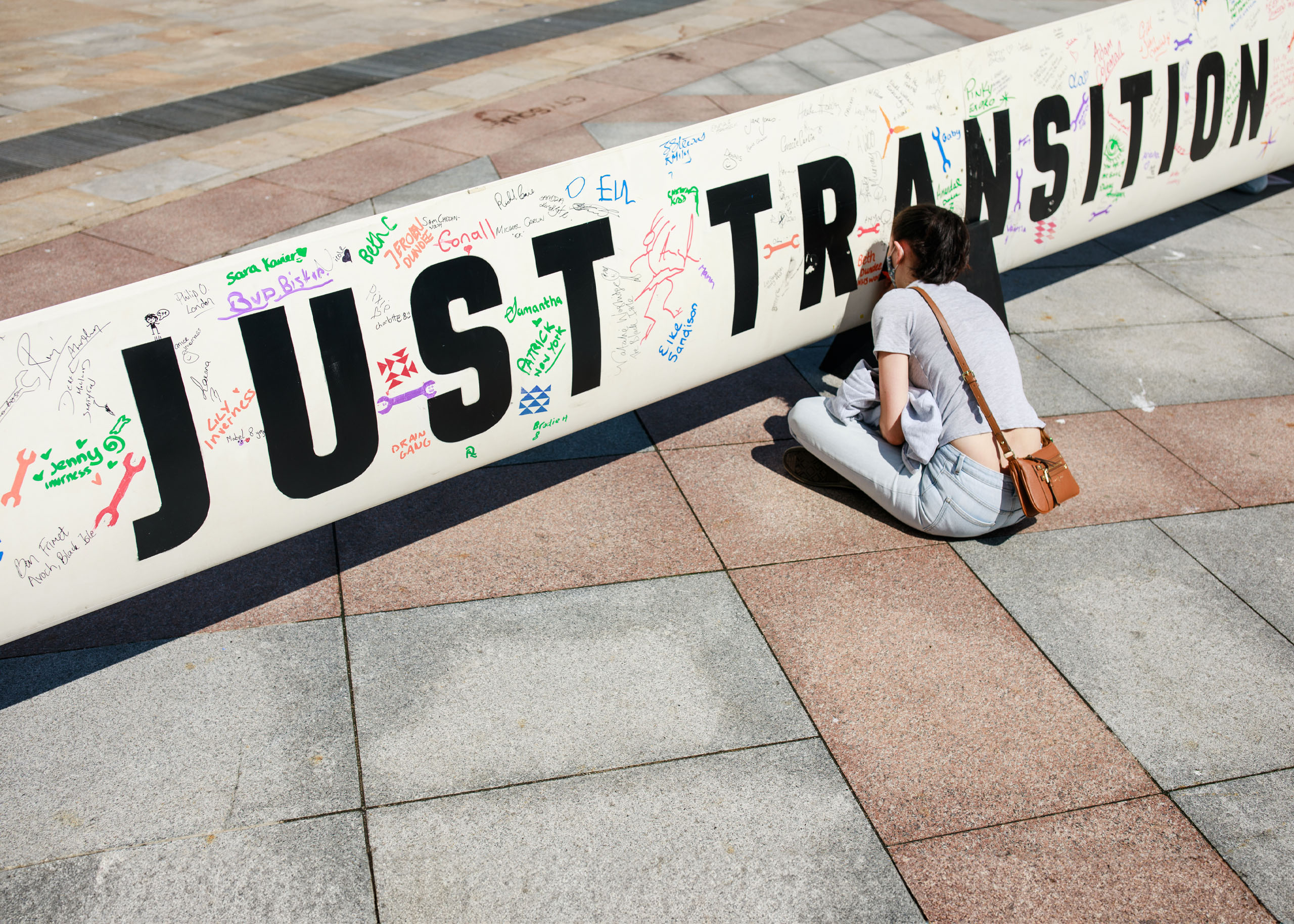
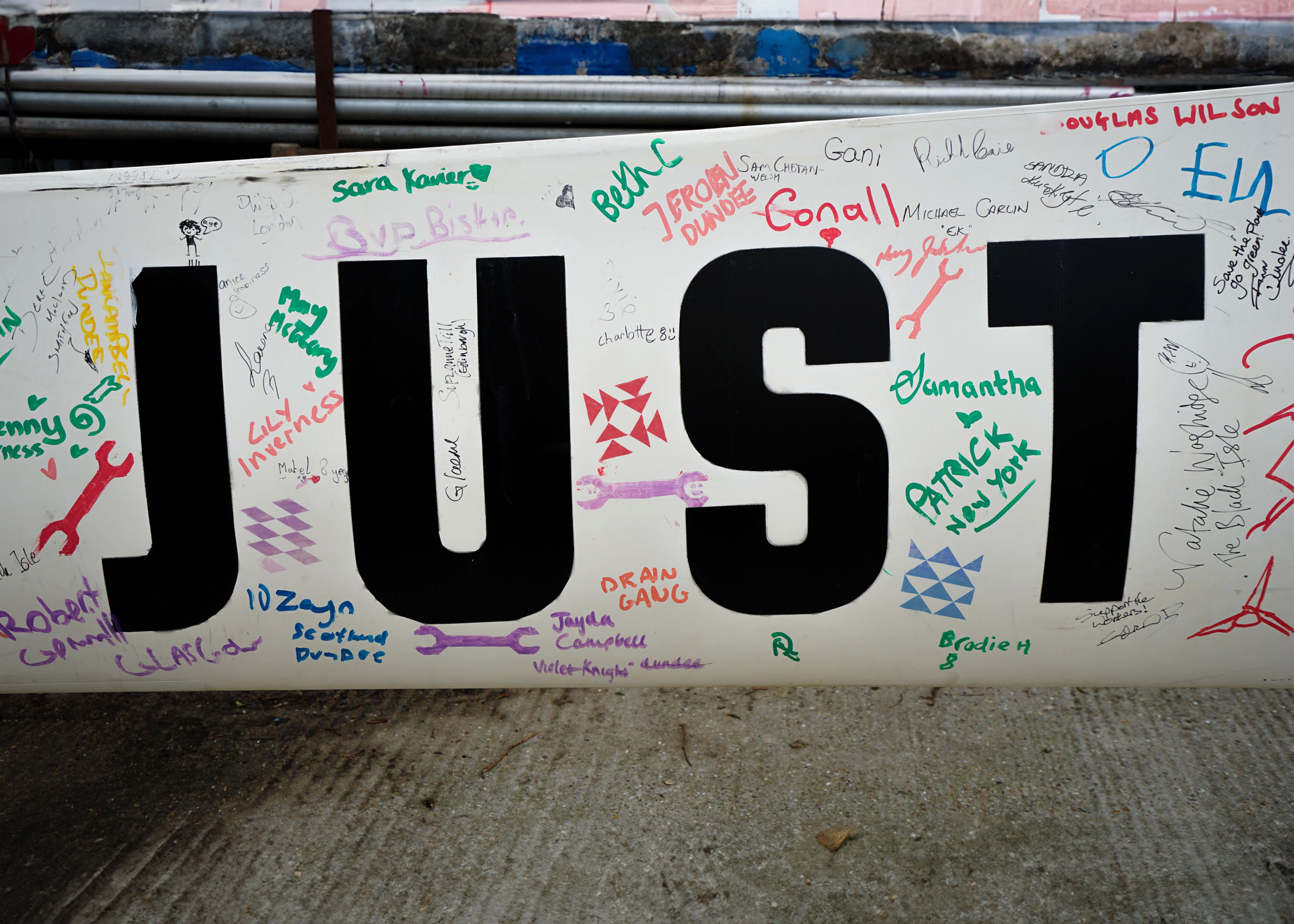
Based online, onshore, and onboard the Rainbow Warrior ship, the campaign would play out across North Sea port cities and on social media. Supporters would get the chance to sign a 16-metre turbine blade.
Clients
Greenpeace
Platform London
Friends of the Earth
What we did
Brand identity
Campaign design
Creative direction
Concept
Strategy
Copywriting
Illustration
Icon design
Toolkit
Social media design
Print design
Creating a flexible visual system
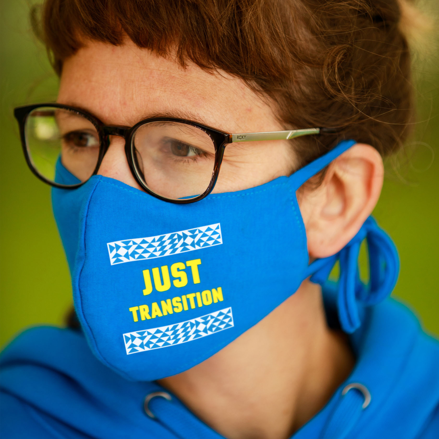
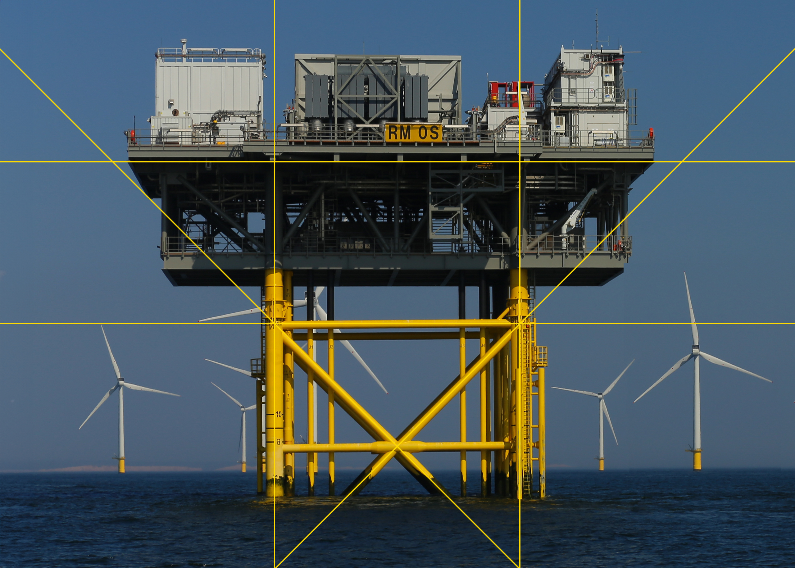
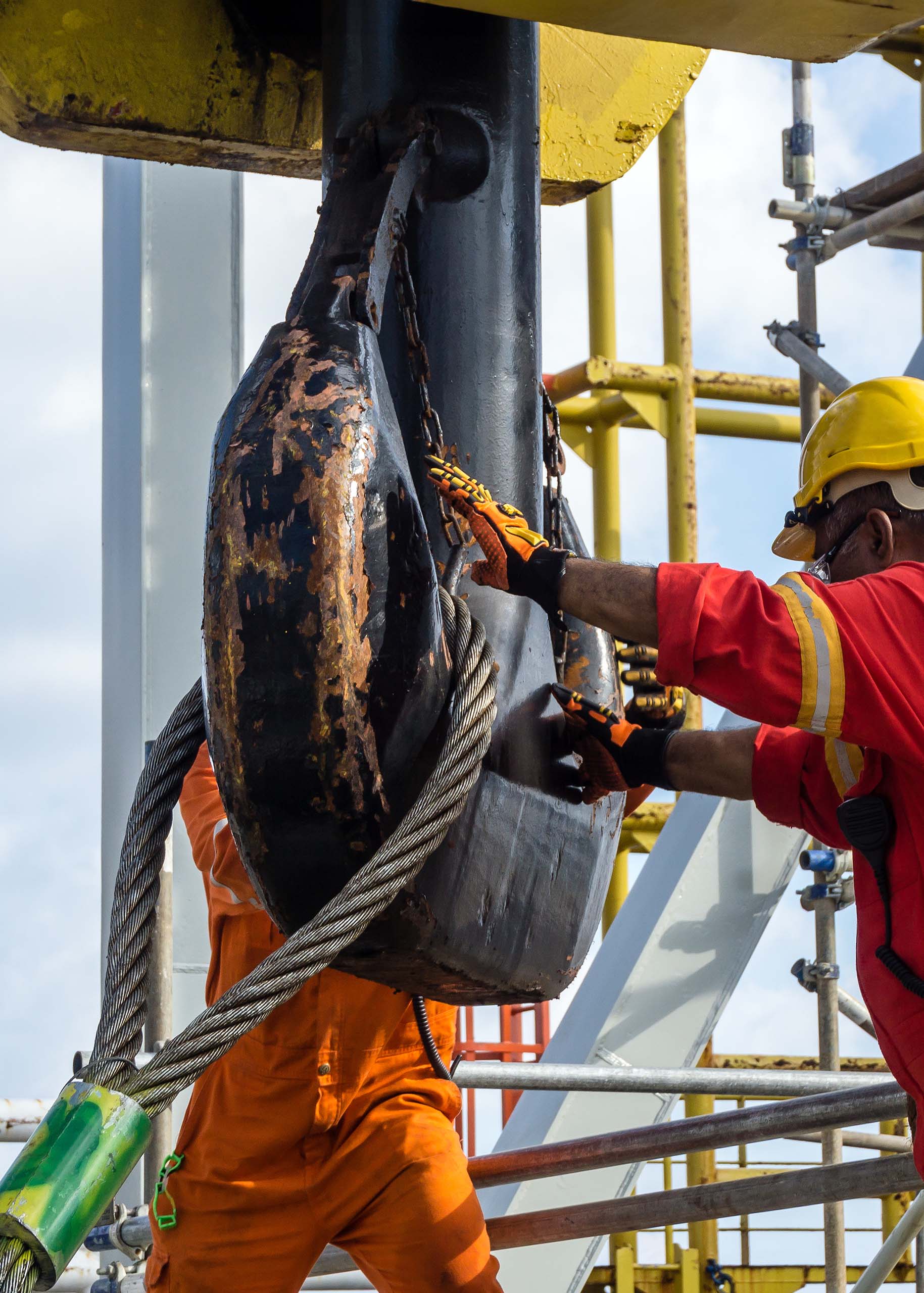
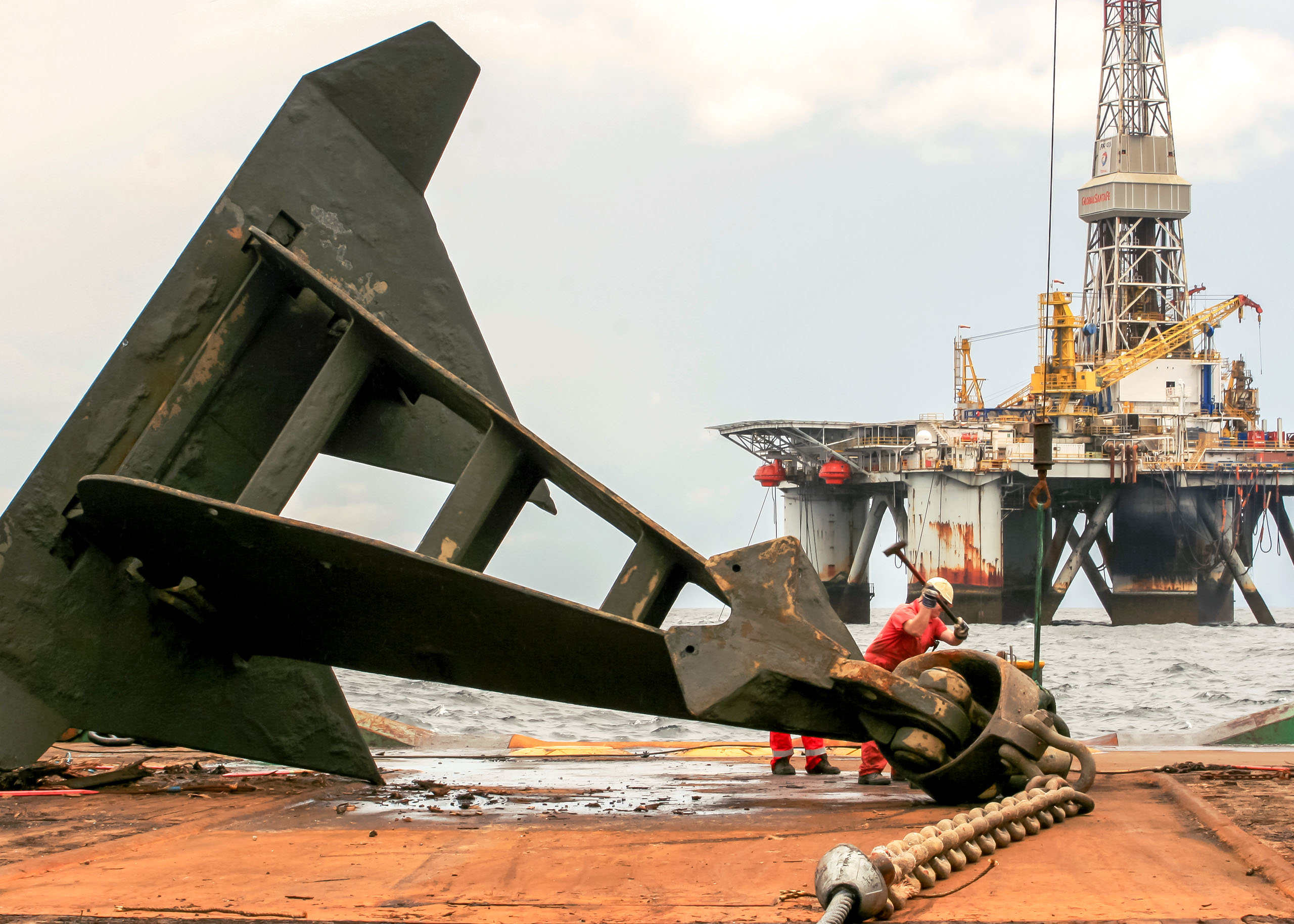
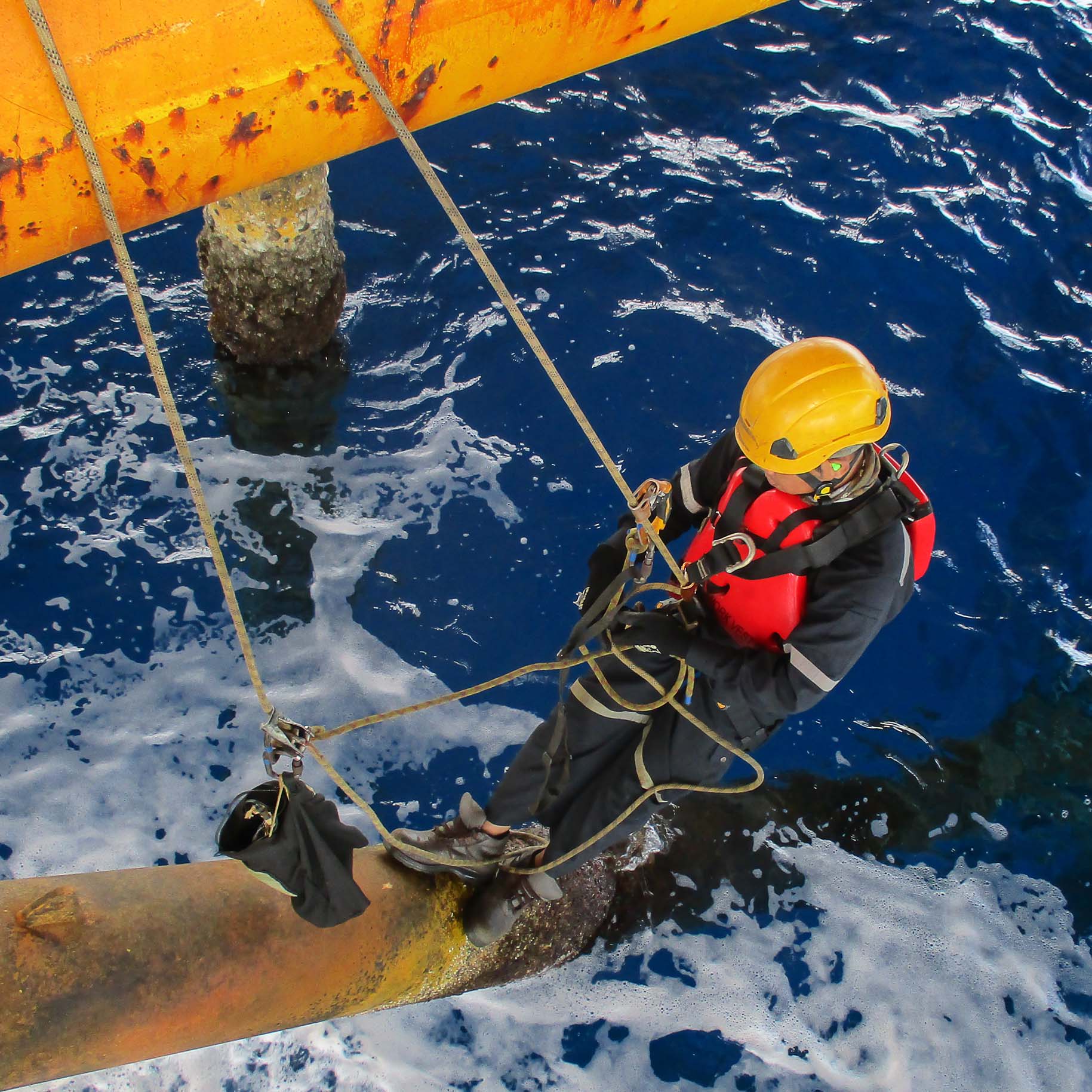
Greenpeace wanted a welcoming campaign reminiscent of past people’s movements. We took inspiration from geometric forms in offshore construction and created a flexible grid system, which we used to guide visual design.

Icon illustration
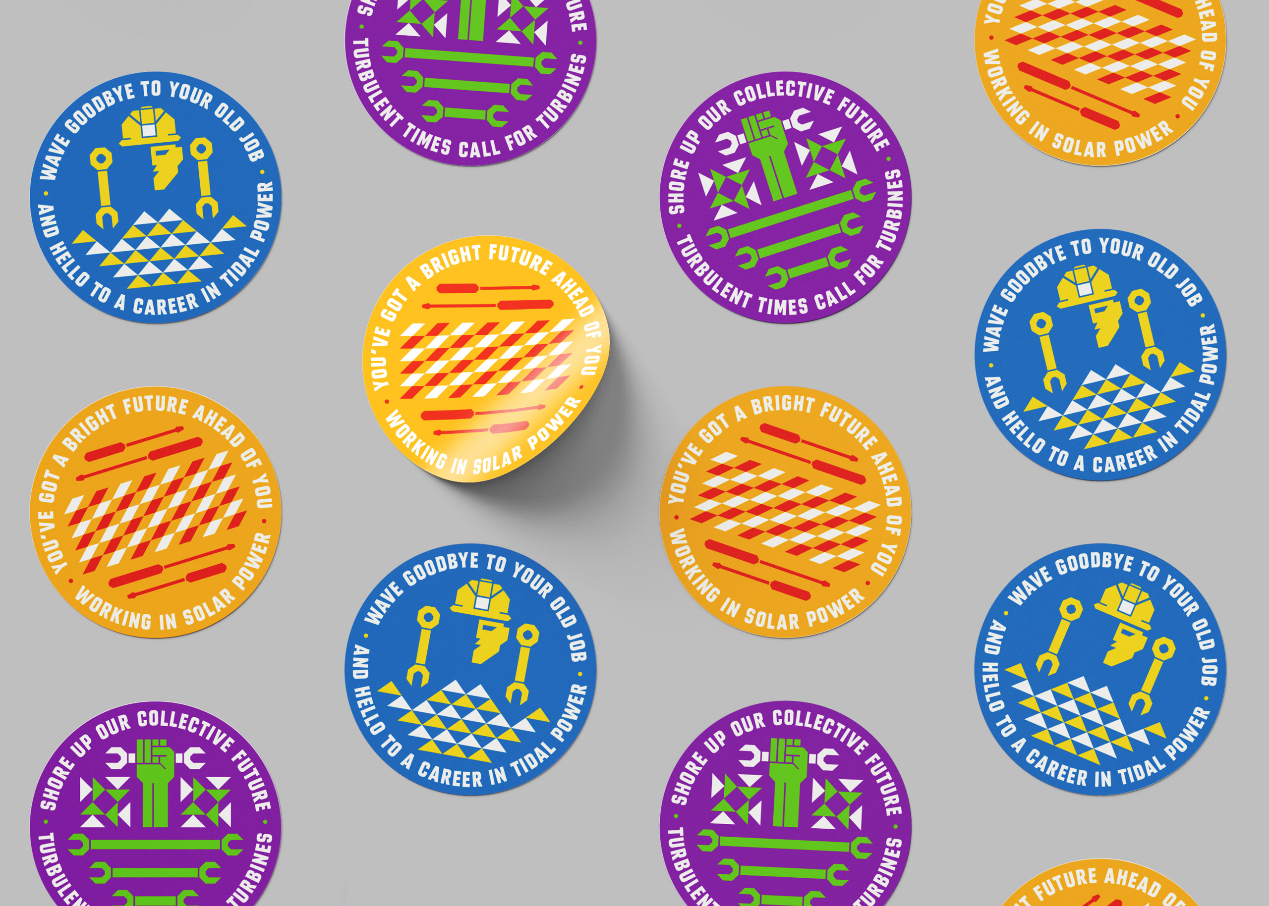
We used the same system to illustrate three icons symbolic of wave, wind, and solar power.
Using colour and type to attract attention
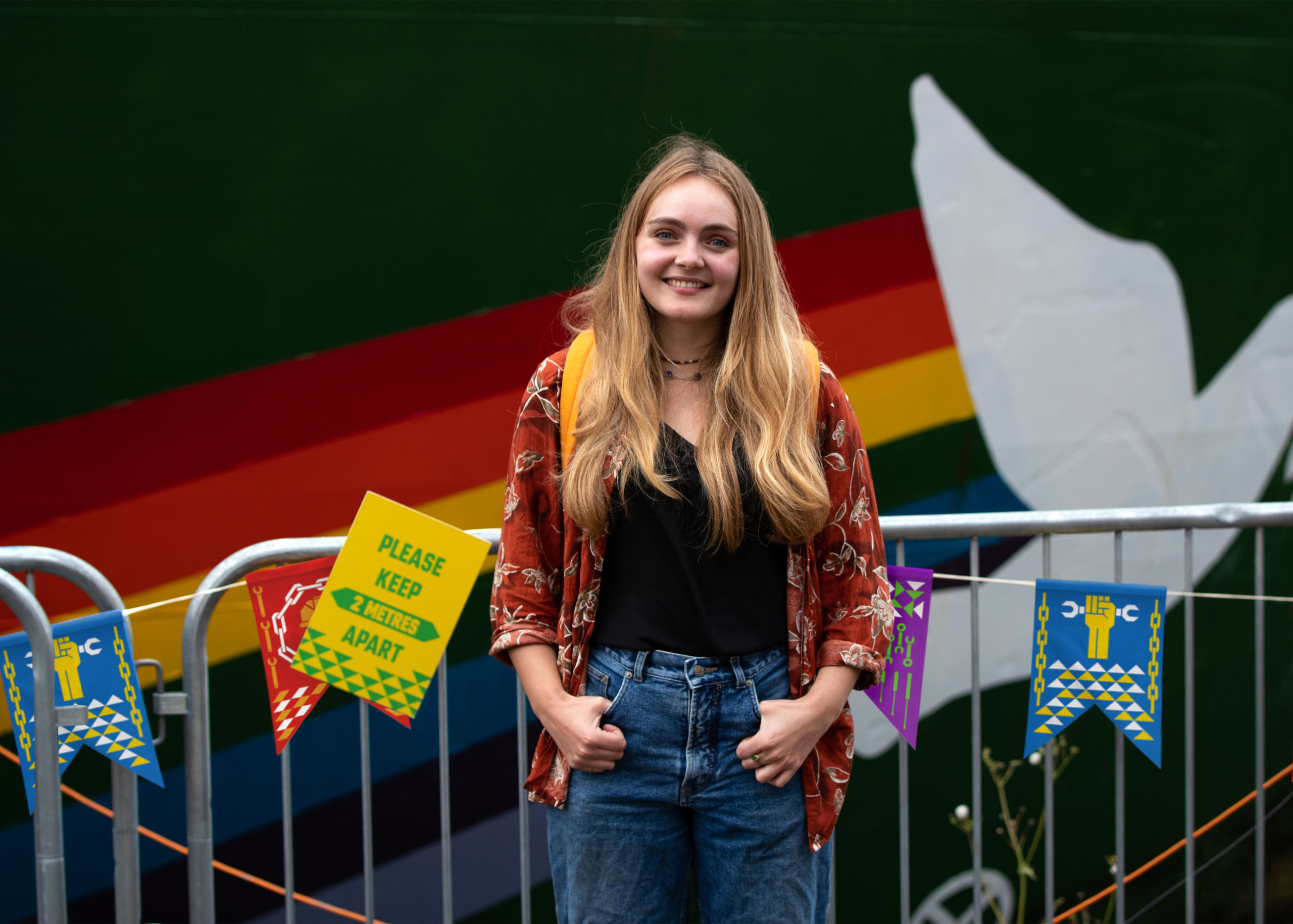
We used the Rainbow Warrior colour palette and a statement-making all-caps font called BN Carta Noir to give the campaign a bright and contemporary look. Both choices ensure our designs stand out against their grey North Sea setting.
Applying our adaptable identity
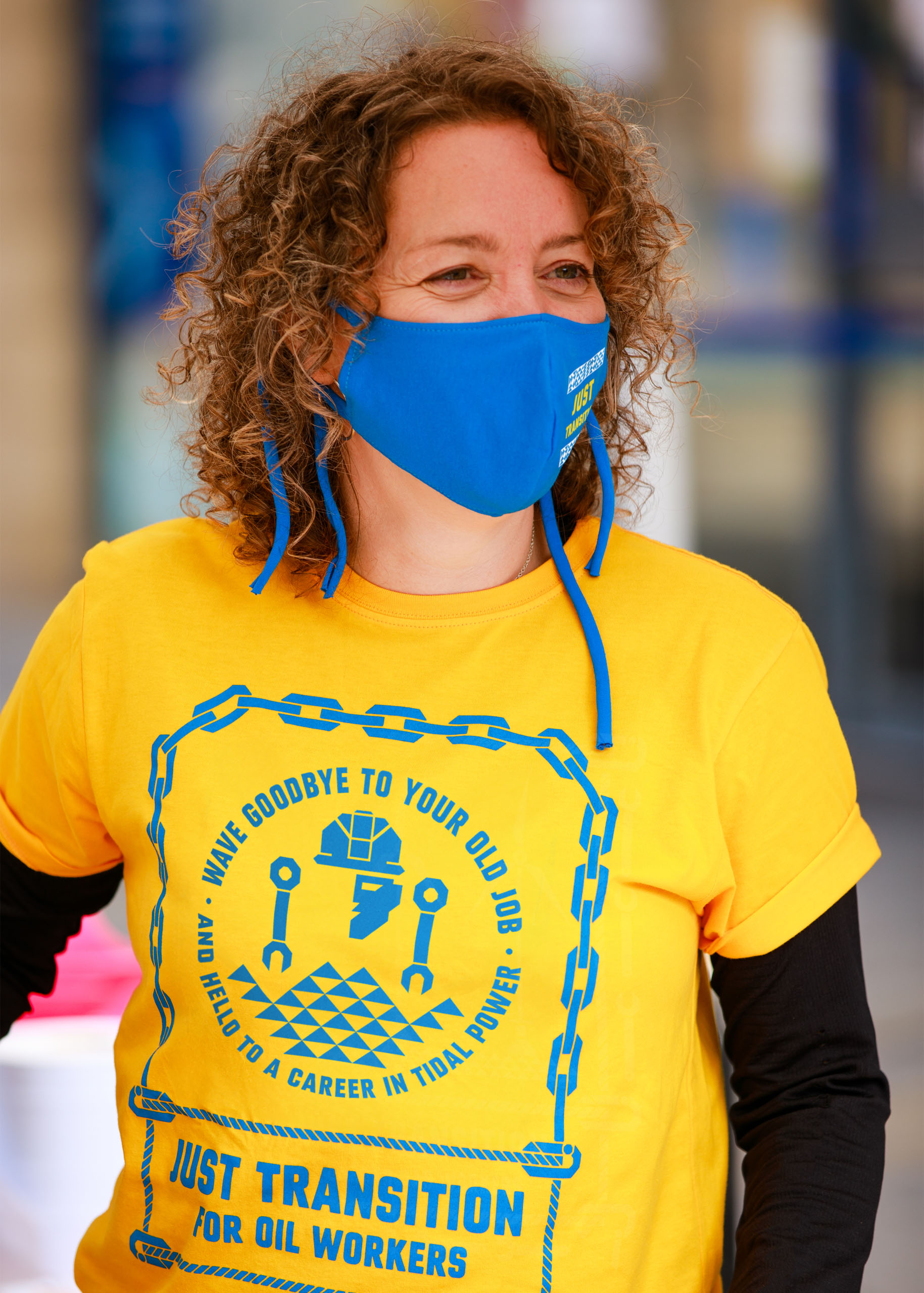
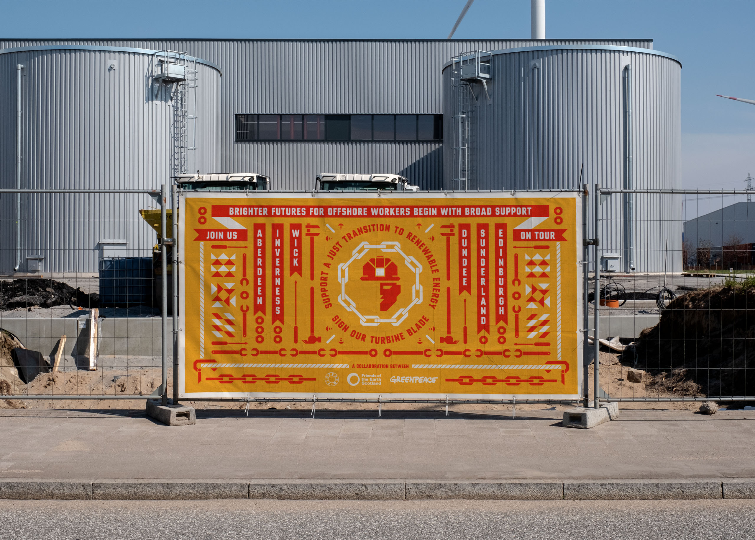
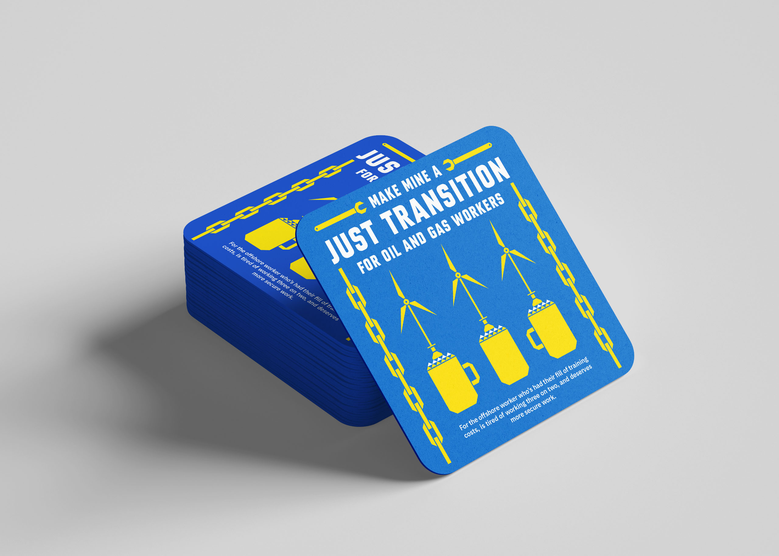
Good visual identities adapt across multimedia. Our system-led process results in reconfigurable assets suitable for application across digital and print-based outcomes. In this case, apparel, banners, beer mats, flags, signage, stencils, stickers, and social media posts.
